Showing posts with label Digipak. Show all posts
Showing posts with label Digipak. Show all posts
Sunday, 31 March 2013
Digipak
Unfortunately my laptop broke and all originals of the digipak were lost. Luckily, I had already uploaded them to blogger so the smaller versions are available to view, but the larger, higher quality versions are lost.

Sunday, 24 March 2013
FINAL Digipak
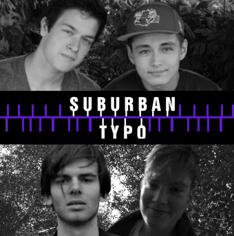
After receiving teacher feedback on the first draft of my digipak, it was decided the look I had created by using two pictures per frame was too cluttered, and that to improve my digipak I should cut it down. Given that I already had the images separated from their background, I decided to choose the strongest image from each pair and put them against another background. I chose the purple/black look to match my website and also decided to add in names so the band could connect with their audience.
Tools used: I used the Gradient tool to create the black/purple look for the backgrounds. For other tools used, see my 'First Draft of Digipak' post.
Tools used: I used the Gradient tool to create the black/purple look for the backgrounds. For other tools used, see my 'First Draft of Digipak' post.


Please note that all the photos used are original images and were manipulated by me.
Thursday, 21 March 2013


Wednesday, 20 March 2013
Casting the rest of the band
For my ancillary tasks, I knew I needed more band members than just Connor. I have therefore been enquiring around my friends to find other boys willing to be part of Suburban Typo. This is who I have found.
 |
| Jack Cooper |
 |
| Patrick Cole |
 |
| Louie Bentley |
Saturday, 2 March 2013
Digipak testing
For my digipak I've decided I want a portrait photo of either the main boy or the main girl for our video on the cover. I started testing with different effects, using a picture of my face.


 |
| I like this image as it can easily incorporate the background I used for my website. |

 |
| This idea makes me seem ghost-like, which I feel would be appropriate given the nature of our video. |
 |
| This effect gives an 'old photo' look, which is again appropriate. |

Thursday, 17 January 2013
Album design #3

Another concept I had for my potential album cover is making the male lead like a ghost behind the girl. This is because in our video we have the girl running back through many different eras with the boy always watching but never seen: quite like a ghost. I've tried to show this with the image above, which I could easily adapt into an album cover if I decide on the concept for my final album cover.
Tuesday, 15 January 2013
Album design #2

Another idea I had for my album art design was using double exposure. I wanted to incorporate both the boy and the girl in this design, and to do this I decided to use the girl's scared eye with a picture of the boy inside. As the boy, Connor, is also the main singer for the band this is useful because it will fit with the convention of displaying band members on the album cover. This cover could also be textually analysed, with the boy being trapped inside the girl to mean that he is always with her no matter where she goes. This is a theme we have presented strongly in our music video, so I like that my album art could reflect that.
Alternatively, I could reverse the roles here. I could make the eye a picture of the boy, and have a photo of the girl visibly trapped inside: as she cannot escape in our music video, it makes sense if this was carried onto the album art. I could also experiment more with the photography that way, by having a photo of the girl miming with her hands against the iris and edge of eye, as if she's actually trying to force her way out but can't.
By doing this mock up I learned how to double expose and change opacities on Photoshop, which is going to be useful for my final design.
Wednesday, 9 January 2013
Album design #1

After doing some research into the digipaks, I tried to make a mock up of what mine would potentially look like by making some sketches and putting them into a CD case with a title on Photoshop. For this idea, I would dress up each band member (all male) in the female costumes the main character wore in all the different eras. This would be something unusual and abstract, but also use the convention I've found in my analyses of presenting the band members as the face of the album.
Tuesday, 8 January 2013
The Killers - Sam's Town digipak analysis
___________________________________________________________________
One thing I found interesting in the digipak aside from that listed above was an insert. It advertised ringtone versions of the Killers' songs for the customers of the CD to purchase and download: this cross media convergence is something I haven't seen much of before in CDs, and it might be an interesting idea to incorporate it in my design too.

Thursday, 25 October 2012


Subscribe to:
Posts (Atom)