Sunday, 31 March 2013
Digipak
Unfortunately my laptop broke and all originals of the digipak were lost. Luckily, I had already uploaded them to blogger so the smaller versions are available to view, but the larger, higher quality versions are lost.
Monday, 25 March 2013
FINAL Website
http://rprice19314.wix.com/suburbantypo
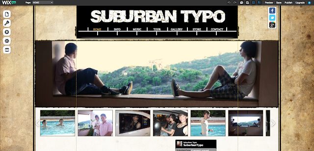
Please bear in mind that this website was designed on and made for a 16:9 screen, so PC and smaller Mac users may experience difficulty. With a bigger budget, these problems could be fixed for the band so that the website could be viewed no matter the mode, but for this small band this is just a technical issue.
Here are some screenshots of how the site should be viewed on an appropriate monitor.
Also, I recently received an email from Wix.com informing me that they'd been having trouble with their Twitter feeds, so if it appears blank this may be why.
Sunday, 24 March 2013
FINAL Digipak
After receiving teacher feedback on the first draft of my digipak, it was decided the look I had created by using two pictures per frame was too cluttered, and that to improve my digipak I should cut it down. Given that I already had the images separated from their background, I decided to choose the strongest image from each pair and put them against another background. I chose the purple/black look to match my website and also decided to add in names so the band could connect with their audience.
Tools used: I used the Gradient tool to create the black/purple look for the backgrounds. For other tools used, see my 'First Draft of Digipak' post.
Tools used: I used the Gradient tool to create the black/purple look for the backgrounds. For other tools used, see my 'First Draft of Digipak' post.
Please note that all the photos used are original images and were manipulated by me.
Friday, 22 March 2013
Editing!
We have now managed to get everything on our timeline in an order we are happy with - finally! We were a bit worried about how it would look because the performance by Connor wasn't as good as we were hoping it to be, but overall I am pleased with the shots we took and the story of our video.
However, when showing this to our teachers we found that they were a bit confused with the concept, and that we needed a little extra something to make it really obvious the girl was going back through the ages.
We then came up with two ideas. Our first idea was to overlay a clock winding round and round quickly at the beginning of each era to show a time progression, and to make it more obvious to a viewer that the girl was going back in time. Secondly, we decided to colourise each individual era differently. Our 80s scene, for example, would be in overly bright colour whereas our 20s scene would be in black and white, with a flickery projector-like effect.
Thursday, 21 March 2013
Wednesday, 20 March 2013
Casting the rest of the band
For my ancillary tasks, I knew I needed more band members than just Connor. I have therefore been enquiring around my friends to find other boys willing to be part of Suburban Typo. This is who I have found.
 |
| Jack Cooper |
 |
| Patrick Cole |
 |
| Louie Bentley |
Thursday, 14 March 2013
Making a logo
After we had decided on our band name, I was thinking particularly about our ancillary products and how most bands have a common logo that appears on their website, their merchandising and digipacks. I thought this would be a good idea to incorporate into my coursework so I immediately set out to create a logo of my own. This is what I ended up with:
In this logo I decided to also incorporate the idea from our video of a girl going back in time. This is why there are the lines in the middle: I wanted to make it look like a timeline. I like this because it makes it stand out more than just having the band name written in a specific font but it is still simple and easily transferable to merchandising and such. Also, when I can easily insert this anywhere by making the white background different colours to fit with whatever colour scheme I use or which ever photo I layer it on top of.
Progression of website
One thing I have been spending my time working on is my website. Although we are continuing to edit and focus on other areas of our coursework, I have spent most of my time on my website to hopefully get it done and then I can focus properly on editing and such.
My website has proven to be fairly tricky for me to create. Having never really used the website builder Wix.com before, I was new to how to create things on the site and achieve the look and feel I wanted.
My first draft of my website looked like this:

My website has proven to be fairly tricky for me to create. Having never really used the website builder Wix.com before, I was new to how to create things on the site and achieve the look and feel I wanted.
My first draft of my website looked like this:

I quite liked this design as I felt the old paper provided an interesting look for the website and also linked with the idea in our music video of a girl going back in time. Similarly, my navigation bar was made to look like a timeline. However, I quickly grew tired of the design as it wasn't quite how I wanted it to look, and I decided to start again.
I kept a saved copy of my original draft, but now that I'd practiced how to use Wix, I felt more confident starting again. I am now much more happy with my second draft as I feel it replicates a lot of the band websites I had seen in the genre. I love the layout and think it's a lot more artistic, and hopefully I'll see this design through to the end!
I kept a saved copy of my original draft, but now that I'd practiced how to use Wix, I felt more confident starting again. I am now much more happy with my second draft as I feel it replicates a lot of the band websites I had seen in the genre. I love the layout and think it's a lot more artistic, and hopefully I'll see this design through to the end!
Saturday, 2 March 2013
Digipak testing
For my digipak I've decided I want a portrait photo of either the main boy or the main girl for our video on the cover. I started testing with different effects, using a picture of my face.
 |
| I like this image as it can easily incorporate the background I used for my website. |
 |
| This idea makes me seem ghost-like, which I feel would be appropriate given the nature of our video. |
 |
| This effect gives an 'old photo' look, which is again appropriate. |
Friday, 1 March 2013
That's a wrap! (Filming our performance...again)
Finally, we are done with our filming! Our second shoot was a success, relocating to Canbury Gardens in Kingston, a park along the riverside. This relocation immediately boosted our work as the park was a lot more scenic and beautiful in comparison to my house, and therefore we were happier with this shoot even before we started filming. We were also lucky in the fact that it was not as cold as our previous shoot (even though it was still extremely chilly), so that we could function.
We all took turns with the filming, using Grace's digital SLR as we do not currently have any cameras at school, and this made the quality of our film clearer. However, this means that the footage will be tedious to upload as the videos are much larger files. We also did not have a tripod or a dolly, so all of our tracking, which was the majority of our footage, was filmed handheld and this runs the risk of an extremely shaky camera.
All in all, I am extremely pleased of today as getting our performance done is a weight off our minds and we now know that if we work together as a group we can get everything we need to done. Also, leading up to the performance I was extremely worried about how it would look on camera given our first try, but I am not very relieved. We also got some more pictures that could be used for the ancillary tasks, which is good.
One thing that was vitally important in our work was ensuring that we had a good variety of shots and angles. We knew from feedback on our previous footage that we hadn't done enough close ups and we made this a priority. One shot I was particularly proud of, however, was a 360° shot that did a full circle around Connor and ended up back with him singing.
Subscribe to:
Comments (Atom)


