My website has proven to be fairly tricky for me to create. Having never really used the website builder Wix.com before, I was new to how to create things on the site and achieve the look and feel I wanted.
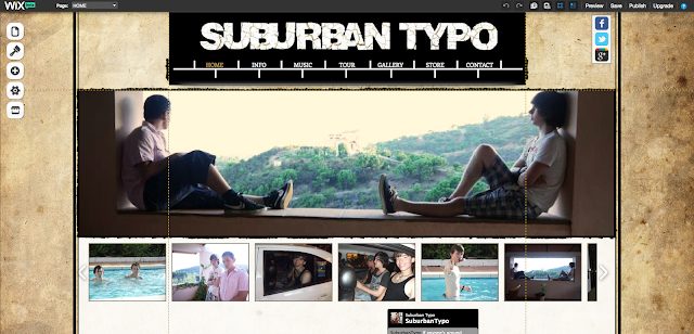
My first draft of my website looked like this:

I quite liked this design as I felt the old paper provided an interesting look for the website and also linked with the idea in our music video of a girl going back in time. Similarly, my navigation bar was made to look like a timeline. However, I quickly grew tired of the design as it wasn't quite how I wanted it to look, and I decided to start again.
I kept a saved copy of my original draft, but now that I'd practiced how to use Wix, I felt more confident starting again. I am now much more happy with my second draft as I feel it replicates a lot of the band websites I had seen in the genre. I love the layout and think it's a lot more artistic, and hopefully I'll see this design through to the end!
I kept a saved copy of my original draft, but now that I'd practiced how to use Wix, I felt more confident starting again. I am now much more happy with my second draft as I feel it replicates a lot of the band websites I had seen in the genre. I love the layout and think it's a lot more artistic, and hopefully I'll see this design through to the end!
No comments:
Post a Comment